Timeline
July-August ( 12 weeks )
PROBLEM
Everyday users face confusion and lack of transparency when trying to find a reliable shipping company and track their large shipments
While planning my move to Finland, I couldn’t find reliable information on shipping companies. I started researching to see if others faced the same issues—uncertainty, hidden costs, and no easy way to compare services or track shipments in real time.
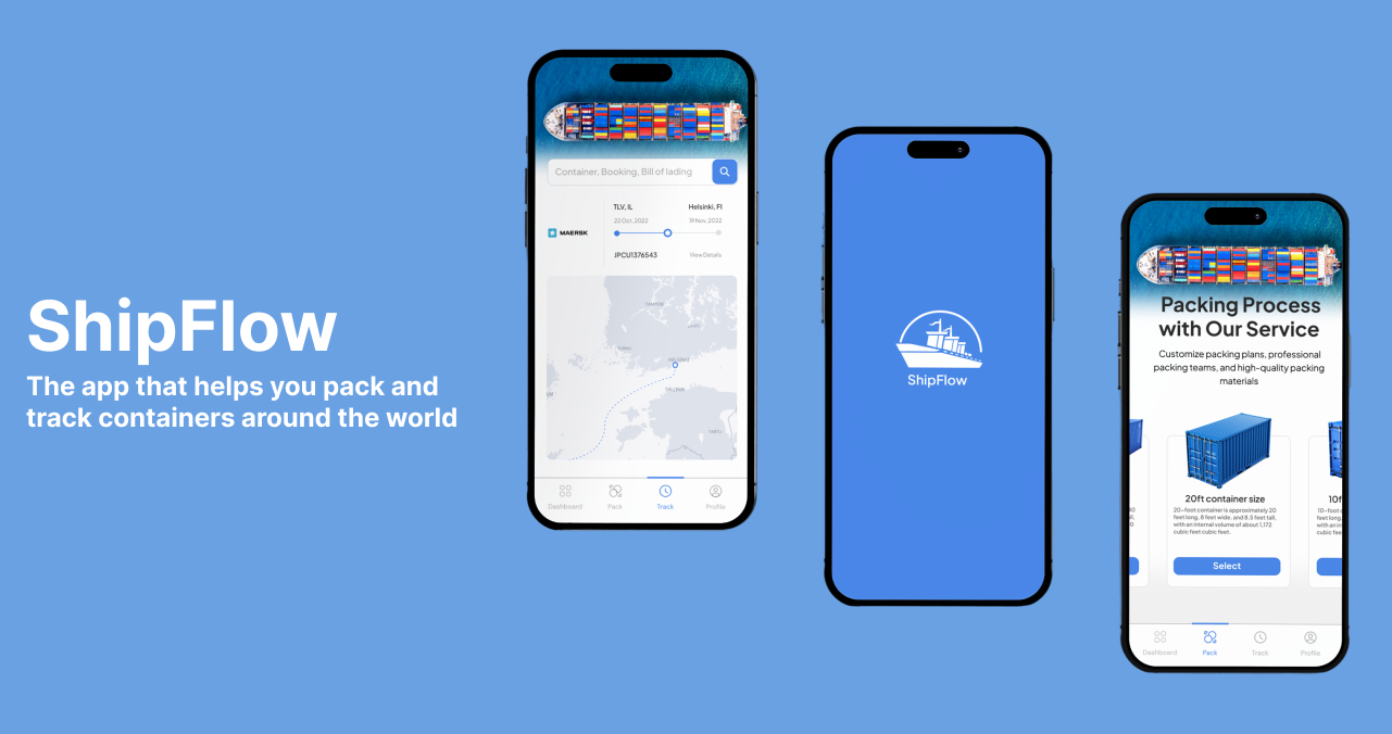
SOLUTION
ShipFlow is a user-friendly app designed to help individuals easily compare shipping companies, book shipments, and track their containers in real time—all in one place.
Key Features:
Shipping Company Finder
Live Container Tracking
Simple Booking & Docs
User Reviews & Company Profiles
Secure & Transparent
Market research
The claim
The global shipping container market was valued at $8.70 billion in 2019, and is projected to reach $12.08 billion by 2027.
The bad
They need more features to see the booking, search for schedules, book vessel, etc. The apps are operationally functional, but their features are still primitive (Maersk, CMA and CGM).
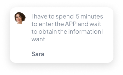
User Survey
I conducted a quick survey among people who are in need of transporting and tracking containers around the world.
What's the most important factor to consider when you want to track your container?

Notable comments


CMA CGM


MCS

WHITE PAPER RESEARCH
way to track shipping containers across multiple carriers with real-time updates, smart notifications and an intuitive mobile experience.
Starting with white paper research, I Began to draw from research articles on the topic goals, motivation, and achievements when i stumbled upon an eye opening research from Gartner Supply Chain Research (2023) :
"By 2026, 75% of global supply chain organizations will invest in real-time transportation visibility platforms (RTTVPs) to improve agility and customer satisfaction."
Problems from the comments

The good
All apps allow you to track the containers with relative ease
Personas
I created persona based on types of users of the app: manager and administrative officer.


High-fidelity prototype
I connected my high fidelity designs into clickable prototype that will allow me to test the app on first group of users.

Prototype validation
I validated my prototype with 3 users. Each were given a subset of the prototype dedicated to the container management I wanted to be sure users understand the flow
I validated my prototype with 3 users. Each were given a subset of the prototype dedicated to the container management I wanted to be sure users understand the flow
Study results
I validated my prototype with 3 users. Each were given a subset of the prototype dedicated to the category product and product detail views I wanted to be sure users understood that there are more products within categories, and that each product also has a dedicated page
66% off users (2 out of 3) were unsure where is the add items button because it was unclear. They quickly understood how to items once they found the page. so change had to be made to make it more clear

Prototype update concept
Because of time constraints, I wasn't able to run a second usability study on the updated prototype however iI have updated it by moving the add button to top right of the screen, same as the save button on the item management page
Despite being financially successful and trending, some companies fail to address core issues that are related to their services, business, and process design:
Process consolidation
Affordability
Lack of complimentary services

Competitive analysis

Maersk
I analyzed 3 of the most popular apps in the field, looking at both the matching experience and negative app store comments, to find patterns
Time to start designing!
After I went through all of my research data, it was time to sketch out the first flows and the initial low fidelity wireframes.

Flow diagram
To outline all the necessary functionalities I created a simple flow diagram of the main tasks the user can do. One of the flows is shown below. Fail state flows were also created, but not shown due to space constraints.

Low-fidelity wireframes
Once the flow diagram was established I started creating low fidelity wireframes of the main flows
My Role
Solo student project for WIZO Haifa Academy of Design
There’s no support for high-volume container monitoring, filtering, or quick scanning.
Manual tracking through spreadsheets and emails wastes time and increases errors.
Users crave a clean, intuitive interface that reduces friction and cognitive load.

High-fidelity UI Design
Once the flow diagram was established I started creating low fidelity wireframes of the main flows
Color palette
Accent, primary, secondary, tertiary, background

Main CTA button color
Font
Plus Jakarta Sans Regular, Medium, Bold
AaBbCcDdEeFfGgHh

Alignment and grid
I picked an 8-point grid for the project and set the margins for within groups at 8 and 16, with margins between groups at 24, 32 and 48
THE MAIN INSIGHT
Logistics professionals are overwhelmed by fragmented, outdated, and passive tracking tools they urgently need a centralized, mobile-first solution that delivers real-time container visibility, customizable alerts, and bulk tracking capabilities.
This insight highlights the intersection of pain (fragmentation, delays, bad UX) and desire (speed, simplicity, control), forming the foundation for ShipFlow’s value proposition.
MAJOR INSIGHTS
Theme 1: Fragmentation and Workflow Inefficiency
Users are forced to switch between multiple carrier websites and tracking tools.
Delayed or missing notifications prevent timely responses to disruptions.
There's no centralized view for multi-carrier operations.
Theme 2: Lack of Real-Time, Actionable Updates
Users want real-time ETAs, delay alerts, and location updates.
Theme 3: Outdated and unfriendly user interfaces
Most current tracking systems have cluttered, desktop-centric UIs that aren’t optimized for mobile.
Existing tools often provide passive data rather than proactive alerts.